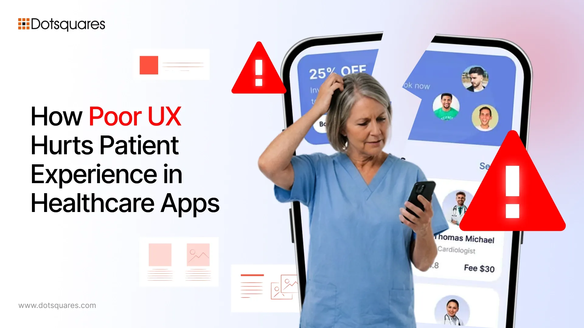
What Bad UX Actually Does to Patient Experience in Healthcare
According to Experian Health’s 2026 State of Patient Access Survey of US patients, conducted across 200+ providers and 1,000 patients, only 18% of patients believe their digital healthcare access has actually improved, even as providers continue investing in new tools and platforms.
That gap between what providers build and what patients experience is a UX problem.
As more people rely on apps and portals to manage their healthcare interactions, the quality of that digital experience directly shapes how patients feel about their care. When the interface fails them, they may disengage, with some delaying care or walking away entirely.
Nobody Has Patience for a Confusing App — Especially Not a Sick Person
Think about the last time you struggled to find something on an app. Frustrating, right? Now imagine you just got a worrying test result back and you are trying to reach your doctor. You open the portal, click around for two minutes, hit a dead end and give up.
For many patients, this happens almost all the time.
Navigation problems are one of the biggest reasons people abandon healthcare platforms entirely. Some of the most common ones:
- Appointment booking is buried three or four clicks deep instead of front and centre
- Messaging and prescription refills are sitting in completely separate, unrelated sections
- Search functions that cannot handle plain language, if a patient types “chest tightness” and gets zero results, they are gone
- No clear sense of where they are in the app or how to go back
A good medical website design agency thinks about who is actually on the other end of the screen, and often it is someone elderly, unwell or stressed. For them, every extra click is a barrier to care.
Accessibility Problems Are More Common Than Most Providers Realise
Here is something that does not get talked about enough. The people who need healthcare apps the most, older adults, people with chronic conditions and those with disabilities, are often the ones those apps fail hardest.
Walk through a few real examples:
- Font sizes that require zooming in just to read a label
- Colour combinations that pass a designer’s eye test but fail contrast standards entirely
- No screen reader support, which shuts out visually impaired users completely
- Forms and menus that cannot be navigated without a mouse or touchscreen
Beyond the human cost, there is a legal one. WCAG (Web Content Accessibility Guidelines) compliance is not optional for many healthcare providers, and ignoring it creates real liability. Medical practice website design that takes accessibility seriously from day one costs far less than retrofitting it later, and it serves far more people.
A Dated Interface Does More Damage Than You Think
Patients are sharing some of their most personal information on these platforms. Medical history, insurance details, and symptoms they have not even told their family about yet. When they land on a portal that looks outdated, loads slowly or behaves strangely, something shifts.
They do not consciously think, but feel that this site looks insecure. And that feeling is often enough to make them close the tab.
Healthcare trust is fragile at the best of times. A well-designed interface does not just look better, it communicates that the provider behind it is competent, careful and worth trusting. It affects whether patients return, whether they complete their care journey and whether they recommend the practice to anyone else.
Working with a medical website design company that understands this psychology is a different proposition entirely from hiring a generalist agency that treats healthcare like any other sector.
The Intake Form Problem Nobody Wants to Talk About
Patient intake forms are everywhere in healthcare apps. They are also, almost universally, a nightmare to fill out. A few reasons why:
- Multi-step forms with no progress bar, patients genuinely do not know if they are halfway through or just getting started
- Unclear required fields that only reveal themselves when the user hits submit and gets hit with a wall of red error messages
- Error text that disappears in seconds, before the patient even has time to read it
- Calendar inputs and dropdowns that simply do not function on certain mobile browsers
Individually, each of these feels like a minor annoyance. Stack them together, and you have a patient who abandons the form, skips the appointment, and does not reschedule. Website design for medical doctors needs to treat the intake form as seriously as any clinical process, because at that moment, it is one.
Most Patients Are on Their Phones. Most Healthcare Apps Are Not Built for That.
Mobile devices have overtaken desktop computers as the primary method of accessing healthcare technology solutions. Patients are now using their phones instead of a computer or tablet to check their test results, communicate with a provider, or schedule a follow-up appointment. Patients frequently access their healthcare via mobile devices and do so while eating lunch or commuting to and from work and while at home relaxing on the couch. Because of this shift in patient access, the design of healthcare applications must produce a seamless experience regardless of where the patient is and at what time; therefore, the applications must perform quickly, reliably, and easy to use in the real world while on the go.
Many do not. Common failures:
- Buttons too small to tap reliably, especially for users with reduced dexterity
- Pages that require horizontal scrolling to read a single sentence
- Login screens that do not support Face ID or fingerprint authentication, forcing patients to remember yet another password
If a healthcare app feels harder to use than a banking app or a food delivery service, patients notice. They may not say it out loud, but it changes how they feel about the provider attached to it.
What Actually Makes a Healthcare App Work
It is not a long list, honestly. Clear navigation. Forms that do not fight back. A mobile experience that holds up. Language that a non-medical person can understand without having to Google anything. Feedback that tells the patient something actually happened when they hit submit.
That 18% patient satisfaction figure from Experian Health is not a technology problem. Providers have the technology. What is missing, far too often, is the design thinking that makes that technology usable for real people in real situations.
If your platform isn’t working the way your patients need it to, Dotsquares can help. The team brings deep expertise in building trusted medical websites, with design services tailored to how healthcare users actually behave not how we assume they do.

Related Post
How To Publish An App To Google Play And App Store?
Discover how to publish your Android and iOS app successfully. Learn Google Play and Apple App Store submission process, requirements, and approval tips
Keep Reading
Cost Of Hosting A Web App On AWS
Learn the cost of hosting a web app on AWS. Explore AWS pricing, monthly hosting costs, key services, and tips for AWS.
Keep Reading
AI Maturity Assessment Guide for Business Leaders
Learn how an AI maturity assessment measures your business readiness, identifies gaps in data, governance & technology to builds a roadmap for AI growth.
Keep Reading